Detail Oriented
In Princeton, copper components and dynamic details add pizazz to a traditional home.
Interview by Marirose Krall, Photos by Tom Grimes, Architecture by Lasley Brahaney Architecture + Construction
Design NJ, October 2020
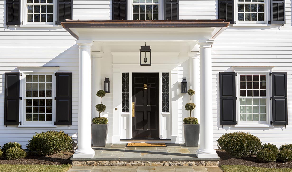
The addition of the portico at the front door added interest to the formerly “flat” facade. “It really enhances the look of the house,” says Brahaney. The new, high-quality, low maintenance shutters are sturdy and substantial according to the architect.
The exterior of Chris and Debbie Sugden’s residence didn’t need a complete overhaul, but a bit of a facelift was in order. The siding was showing its age and the overall appearance needed an update. To spruce up their home’s facade, the Sugdens called on Marc Brahaney, owner of Princeton-based Lasley Brahaney Architecture + Construction.
DESIGN NJ: What is the architectural style of this house?
MARC BRAHANEY: This is a colonial built in the 1950s. If you look back
at past styles, this home fits in the “Adam” colonial house category. It’s
reminiscent of architecture dating from the late 1700s to early-to-mid
1800s. Elements of this style include a symmetrical exterior with the entry
door as the focal point, multiple pieces of trim around the front door
including a fan-shaped window or wood panel above the door, individual
double-hung windows that are not ganged together and that align both
vertically and horizontally with panes of glass divided by muntin bars
(small strips of wood), shutters and two to four chimneys. This is a builder version of what colonial
architecture looked like at the time colonial was original to this country.
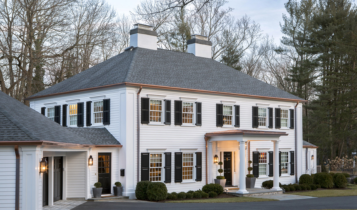
The refreshed facade includes a new covered porch and copper accents. “We were very careful how we placed the copper so the downspouts don’t conflict with the big columns in the corners,” notes architect Marc Brahaney.
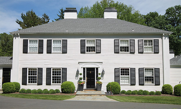
The existing facade was fine, but lacked a “wow” factor. “We tuned up the exterior and made it more elegant,” says Brahaney.
DNJ: What was the impetus behind the project?
MB: The pre-renovation house was dressed up with shutters, with trim at
the front door and with large pieces of trim at the corners that were meant
to mimic a giant order of columns. Other than that, it was fairly plain and
unadorned. It was a little bit like a blank slate and it was fine; but the
owners had reached the point where they needed to refurbish the exterior.
The siding needed some maintenance and replacement. The shutters
weren’t in good shape. The windows, which were original to the home,
were not operating well. The owners took the need to do some significant
maintenance as an opportunity to reconsider how they wanted the house
to look. That led them to call us and ask us about options.
DNJ: What was the scope of the project?
MB: A fair amount of the siding had deteriorated badly, so we replaced
those portions in keeping with the look of the existing siding. The project
also involved adjusting the nature, proportions and detail of the trim,
while working within the constraints of the mass of the house. For example,
the giant columns on the corners were just flat board. We added new columns with a recessed panel for interest.
Along the tops of the windows, we incorporated
elaborate trim.
We also replaced the garage doors, which were okay but kind of tired. They weren’t on a par with what we were doing with the rest of renovation. That’s always a challenge with a project — knowing where to stop the level of intervention. You don’t want a situation where you do a lot of work, but leave 25% of what was there. That can make the new elements look unfinished.
The biggest change was the addition of a covered porch on the front of the house. That was designed to take what was a very flat and plain massing on the front and fine-tune and modulate it by adding a significant front porch. It really enhances the look of the house.
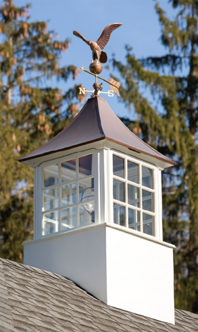
The cupola on the garage features a copper top with a weathervane.
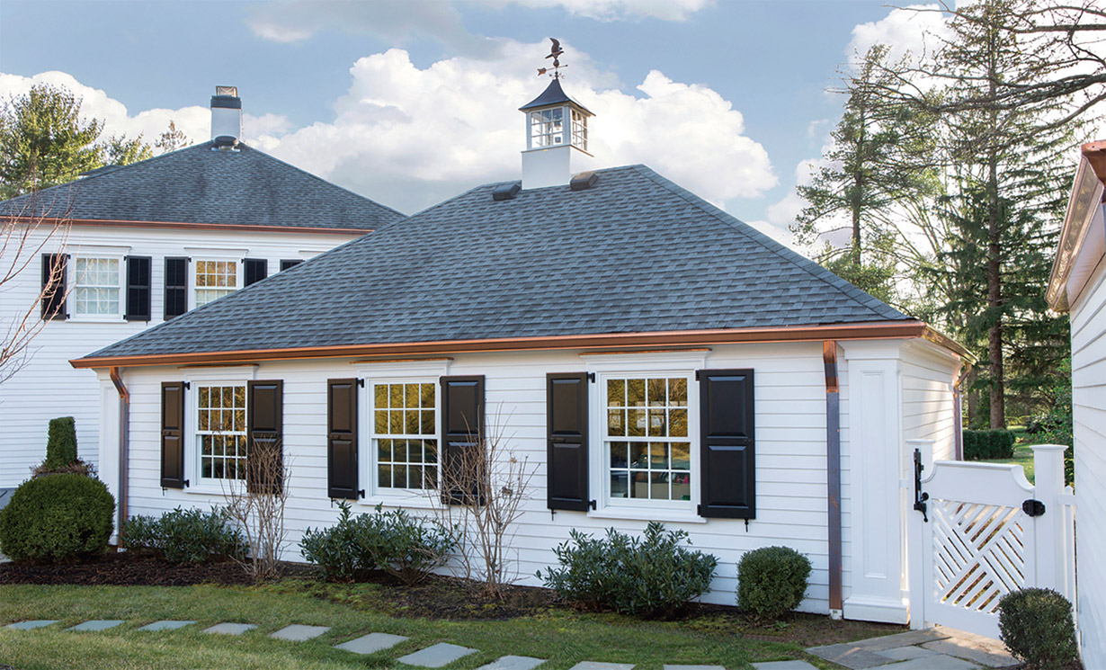
The rear facade of the garage, like the front, was enhanced with new shutters, copper drainpipes and trim above the windows.
DNJ: The copper elements also enhance the look.
Whose decision was it to use copper?
MB: Copper is a metal that’s been around for
centuries. It remains popular because it’s so
effective and so versatile.
We were planning to put copper on the roof of the covered porch, but we had assumed that we would stay with aluminum for the gutters and downspouts. Copper is one of the most maintenance-free materials, but aluminum is also relatively maintenance free. Not everybody feels they need copper. It’s expensive; so it’s a personal choice. The client actually came to us and said, ‘What would it take to do copper? We like the look.’
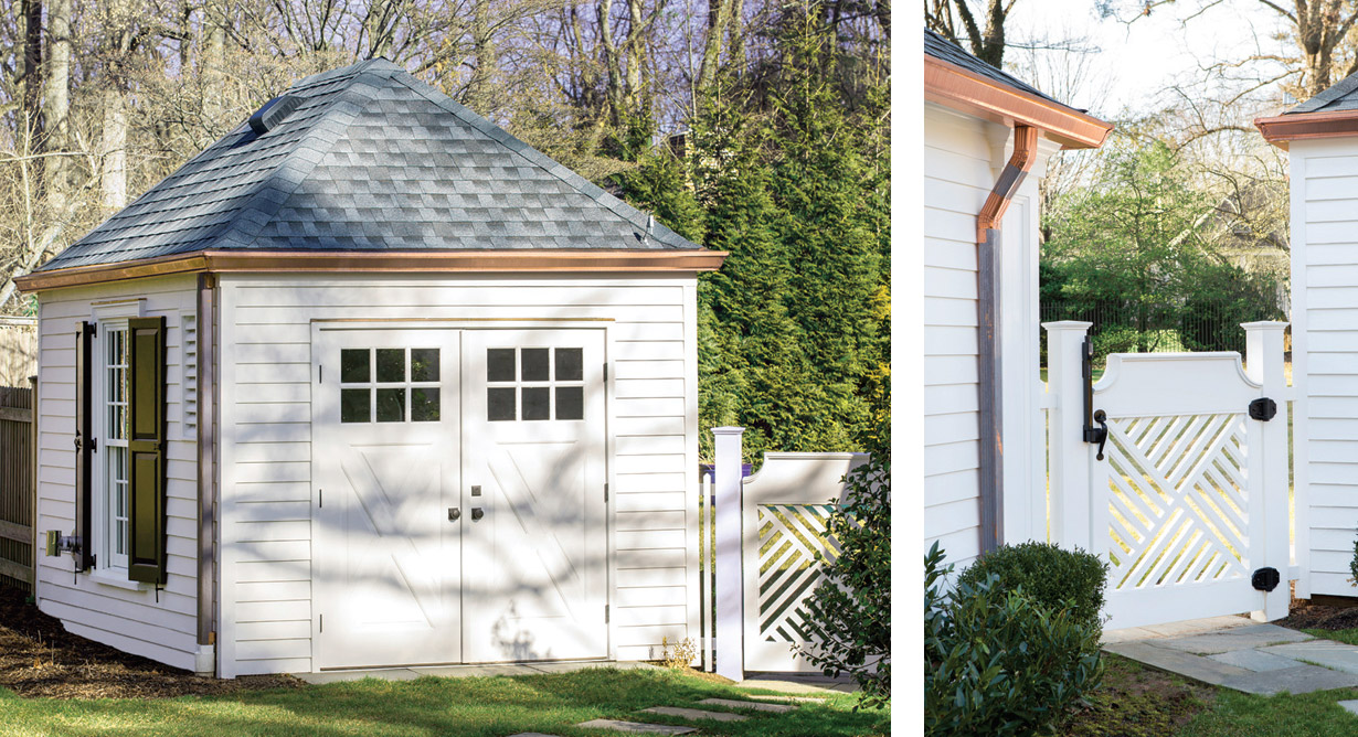
“COPPER IS ONE OF THE MOST MAINTENANCE FREE MATERIALS.”
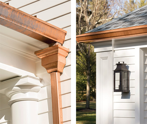
The copper gutters and downspouts were thoughtfully selected for both practicality and aesthetic appeal. They are large enough to handle runoff effectively, but were strategically placed on the three buildings so as not to interfere with or obstruct the other decorative details, such as columns, sconces or shutters.
DNJ: What were the challenges of this project?
MB: Design-wise, we were working with some
constraints that we wouldn’t have had to deal
with if we were designing the house from the
ground up. The roof overhangs are very shallow.
If we’d designed the house from scratch, we
would have created deeper overhangs to add
shadow and detail. We would have made the
walls taller to give ourselves room to include
more trim at the top of the exterior walls, like a
frieze board, crown molding and possibly dentil
moldings. We made up for that by adding the
prominent gutters. We increased the size and
detail of the trim around the windows. We
included copper caps at the heads of the
windows. Also, the shutters we selected are
significantly more substantial than the originals
and they are installed with hardware that allows
them to operate instead of simply being nailed
to the siding.
Overall though, this was a smooth-running project. The clients were great and really interested in the details that we envisioned. We had many discussions with them and they listened to our suggestions. It was a very good experience.
SOURCES: facade renovation, Lasley Brahaney Architecture + Construction in Princeton; cupola on garage, Walpole Outdoors™ through Kale’s Nursery & Landscape in Princeton; Boral Building Products’ Duration® frieze boards, pilasters and trim through Hamilton Building Supply in Hamilton Township; Endurian® shutters, Timberlane; pool shed door, Simpson Doors through Niece Lumber in Lambertville; garage doors and Odyssey® garage door openers, Overhead Door Corporation; windows, Marvin; front masonry stoop, John Kochis Landscaping in Pennington; PermaCast® columns, HB&G through Hamilton Building Supply; front porch trim, Boral through Duration at Hamilton Building Supply; copper roof and flashings on portico, Flesch’s Roofing & Sheet Metal Co., Inc. in Mercerville; copper gutters and downspouts, Gutterman in Princeton.


