Design NJ: Open & Shut
A kitchen renovation in Skillman is all about making — and breaking — connections
Writer: Marirose Krall
Photographer: Tom Grimes
Architect: Lasley Brahaney Architecture + Construction
Location: Princeton, NJ
The original kitchen in Linda and Greg Osberg’s Skillman home was laid out inefficiently. “The breakfast area was separated from the work area,” says Marc Brahaney, owner of Princeton-based Lasley Brahaney Architecture + Construction. In addition, the homeowners were unhappy that the space opened into the foyer.
To remedy the situation, the Osbergs called in Brahaney, who with his colleague, Kim Wentzel, architectural designer at Lasley Brahaney, designed a new kitchen better suited to their needs and style preferences. The renovation involved reorganizing the space within the original footprint of the kitchen and dining area.
The first step was removing the doorway to the foyer. “The clients didn’t want to see through to the kitchen from their front door, so we filled in that opening,” Wentzel says. The second step was improving the connection and traffic flow between two distinct spaces. Brahaney explains, “We took out the low wall and peninsula and reoriented the cabinets so you can walk from the work area to the breakfast area.”
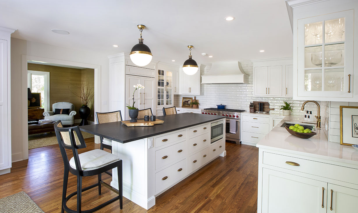
The Osbergs’ new kitchen is airy, bright and streamlined. The Lasley Brahaney team transformed the space to create more of an open plan. “We widened a doorway to the adjacent sitting area to make a connection between the spaces,” architect Marc Brahaney says.
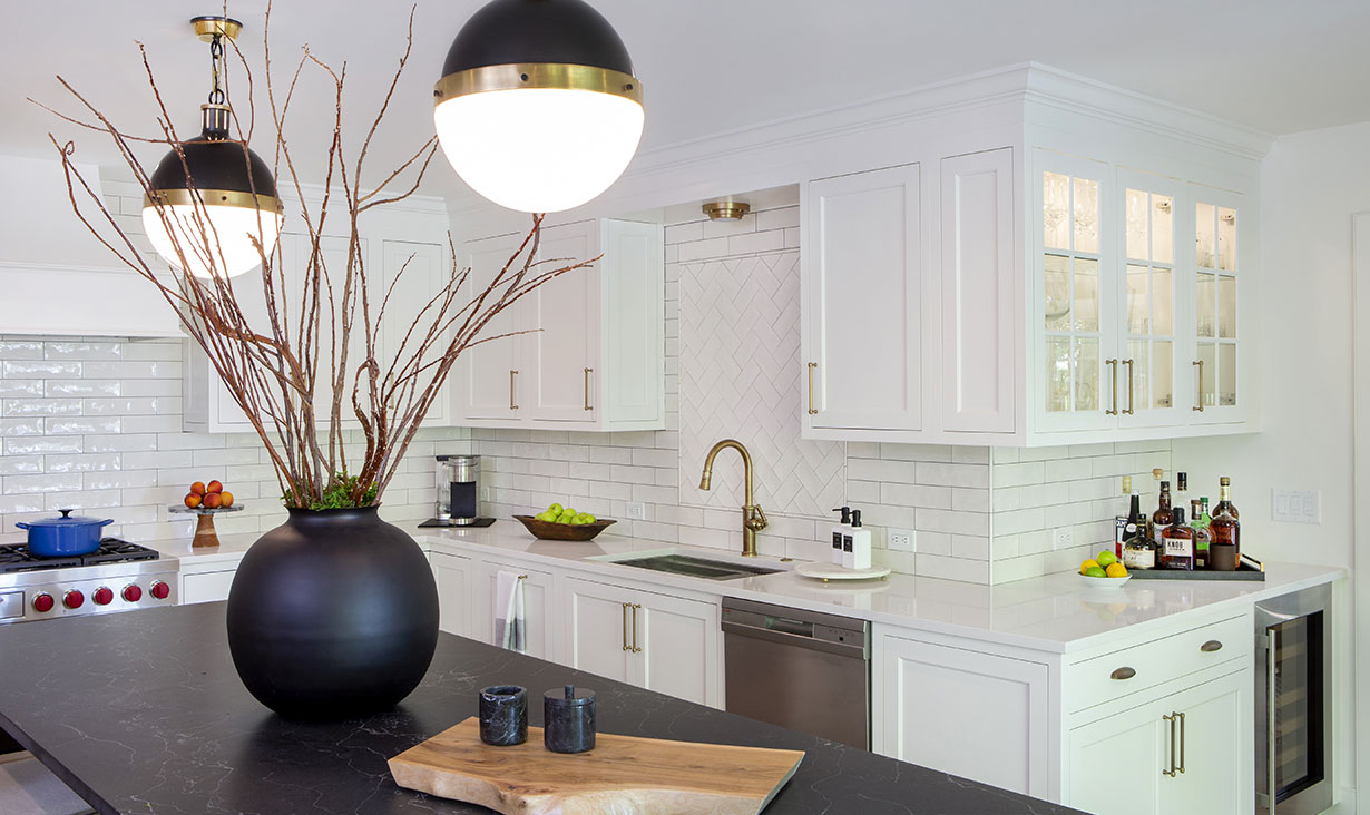
The new design features additional cabinet space in what was formerly the dining area. The windowed cabinets are lit from within.
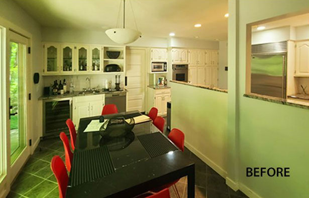
Before: A half wall hindered the flow of traffic between the kitchen and the dining area in the original kitchen. And, with a crowded wall of cabinetry surrounding a narrow doorway on the far wall, the connection between the kitchen and the adjacent sitting room was all but nonexistent.
The new cabinet configuration optimizes storage while creating a much airier aesthetic. A large island, which replaced a dining table as the spot for casual meals, offers both drawer space and seating for four. Additional cabinetry — featuring a wine refrigerator and windowed upper cupboards — was added in a corner where an awkward passthrough was removed.
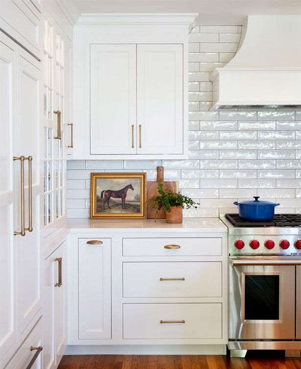
A doorway to the home’s foyer was closed up during the renovation to create an uninterrupted wall for cabinetry and a range.
![Before: The cabinets [in the original kitchen] were typical for their day. The kitchen was designed and built in the 1970s. The new homeowners sought an updated look along with an arrangement and style suited to their needs and taste](/_assets/img/press/open-and-shut/nj-kitchen-before-renovation-2.jpg)
Before: “The cabinets [in the original kitchen] were typical for their day. The kitchen was designed and built in the 1970s. The new homeowners sought an updated look along with an arrangement and style suited to their needs and taste,” Brahaney says. Brahaney’s associate Kim Wentzel agrees. “The original cabinets, like the home, had a ’70s vibe. The new homeowner envisioned an updated, transitional kitchen.” The door next to the refrigerator leads to the home’s entry. The renovation involved closing up that opening to create a solid wall.
Another set of windowed cupboards, this one next to the refrigerator, joins the first set in adding interest, displaying the homeowners’ china and crystal pieces, and creating places for the eye to pause within the long run of white cabinetry. In addition, Brahaney notes, “the glass doors create a lot more openness.”
Adding openness is a wide doorway between the kitchen and a sitting room. Formerly a narrow, closed door flanked by two full walls of cabinets, the passage was widened to establish a sense of connection between the two rooms.
The renovated kitchen is crisp, clean and bright, its white foundation juxtaposed with black accents in just the right proportion to be bold but not overpowering. “Style-wise, it’s transitional,” Wentzel says. The look is straightforward with lots of smooth surfaces. “The cabinetry has clean lines,” Brahaney adds, “with inset, versus overlay, doors and drawers.” Wentzel notes, “They’re definitely more streamlined than profiled cabinet doors.”
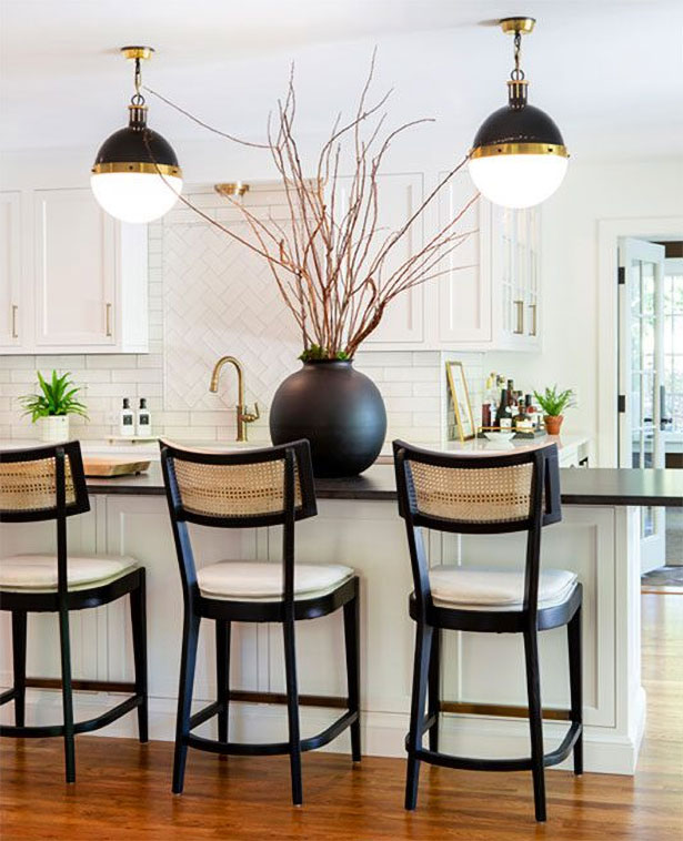
Black accents create a striking contrast to the kitchen’s white foundation.
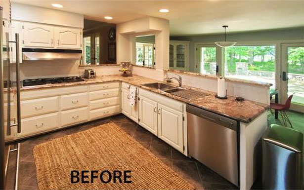
Before: A peninsula and two awkwardly placed passthroughs made the old kitchen feel small and imbalanced. With the half-wall removed, the new kitchen island takes advantage of the space from the previous dining area.
Brahaney says a renovation of this type — rearranging an existing space — can be tricky. “It was not initially clear to us how the house was constructed. The original design was tightly woven together. We had to do a lot of exploratory opening of ceilings, posts and walls to understand the existing structure. Once we understood the structure, we pulled in our engineer to give advice on what we had to do to open up the space and make sure the building was structurally sound.”
Complications aside, the homeowners are thrilled with the finished space, Brahaney says. “The clients really like the stronger connection between the work area and the breakfast area, and they’re happy with the island that allows everyone to gather in the kitchen.”


